What are analogous color schemes and how do you use them?
In art, there are a number of color schemes that artists can use to create their work. One such scheme is an analogous color scheme. Analogous color schemes are created by selecting three colors that are next to each other on the color wheel. For example, you could choose red, orange, and yellow; or blue, green, and purple. Analogous color schemes are often used in nature photography, as well as in illustrations and paintings that seek to capture the beauty of the natural world. In this blog post, we will explore how you can use analogous color schemes in your own work.
What is an analogous color scheme?
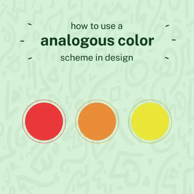
Analogous color schemes are those that use colors that are adjacent to each other on the color wheel. This can create a very harmonious effect, as these colors naturally work well together.
To use an analogous color scheme, you’ll want to choose a dominant color, and then two or three accent colors. The dominant color will be the one that you use most prominently, while the accent colors will be used to add some interest and variety.
When using an analogous color scheme, it’s important to pay attention to the amount of contrast between the different colors. Too much contrast can make the scheme appear jarring and unbalanced, while too little contrast can make it look dull and lifeless. The best way to achieve just the right amount of contrast is to experiment until you find a combination that pleases your eye.
What are the benefits of using an analogous color scheme?
Analogous color schemes are created when three colors that sit next to each other on the color wheel are used together. This color scheme is often found in nature, and is a pleasing, harmonious way to choose colors.
There are several benefits of using an analogous color scheme:
1. The colors work well together.
2. They can create a sense of cohesion in your design.
3. Analogous color schemes can be used to create a calming, relaxing atmosphere.
4. They can also be used to make a space feel more energetic and exciting.
5. If you want to add a pop of color to your design, using an analogous color scheme is a great way to do it without making the design feel too busy or overwhelming.
How to create an analogous color scheme
Analogous color schemes are created by choosing three colors that are next to each other on the color wheel. To use an analogous color scheme, you can choose one dominant color and two supporting colors. The dominant color will be the main color used in your design, while the two supporting colors will be used as accents.
To create an analogous color scheme, start by finding a color wheel. Then, choose three colors that are next to each other on the wheel. For example, you could choose red, orange, and yellow. Once you have your three colors chosen, you can begin using them in your design.
The dominant color should be used for the majority of your design. This could be the background color or the main element in your design. The two supporting colors can be used as accents. For example, if you’re using a red background, you could use yellow and orange as accent colors. Analogous color schemes are easy to create and can add interest to your designs.
Analogous color list
There are 12 analogous color combinations. One way to create a basic color scheme is with 3 colors, which consists of a section of the color wheel each. To better understand what 3 colors make up each group, take a look at the analogous color list below:
- Yellow – Yellow-green, yellow, yellow-orange
- Yellow-Orange – Yellow, yellow-orange, orange
- Orange – Yellow-orange, orange, red-orange
- Red-Orange – orange, red-orange, red
- Red – Red-orange, red, red-violet
- Red-Violet – Red, red-violet, violet
- Violet – Red-violet, violet, blue-violet
- Blue-Violet – Violet, blue-violet, blue
- Blue – Blue-violet, blue, blue-green
- Blue-Green – Blue, blue-green, green
- Green – Blue-green, green, yellow-green
- Yellow-Green – Green, yellow-green, yellow
The Color wheel
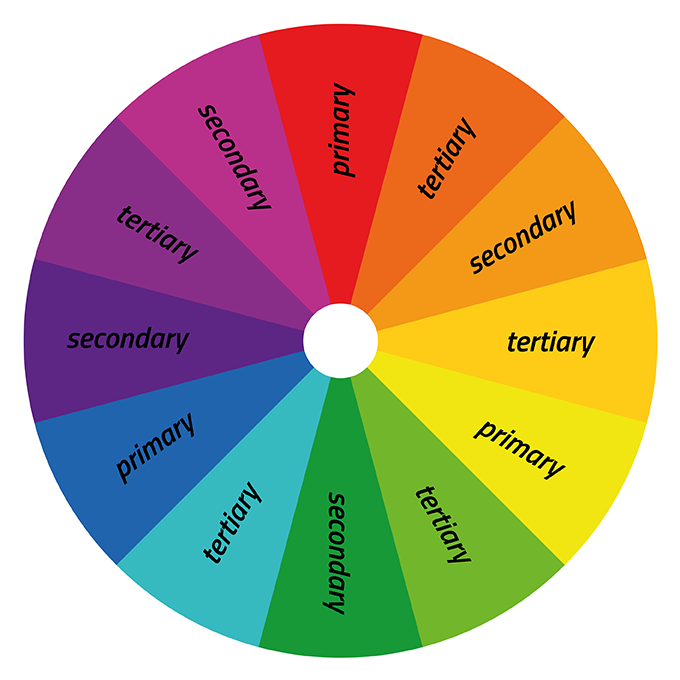
One way designers pick the best colors is by using the color wheel. It divides primary, secondary, and tertiary colors into three sections each: red like a stop sign, green like grass and blue like the sky. But there are also secondary colors which are really cool-purple and orange for example.
The color wheel is used to showcase the different colors of the spectrum, including primary, secondary, and tertiary colors. There are also variants that have hues, shades, tints, and tones.
By visualizing how colors relate to one another on a rainbow color scale, we can create bespoke color schemes that produce aesthetic harmony. This color wheel lets us explore the different variants in more depth:
Hue
All colors have a hue. One of the six original primary colors is red, another is green. You’ll find other shades or tints in every color.
Shade
Shades are created when black is added to a hue, which is always the color’s darkest hue.
Tint
Tints are the opposite of shades and refer to how much white is added to a color. So, a tone lightens and adds brightness.
Tone
A tone is created by mixing black and white with a certain color. In other words, the tone is any hue that has been changed with the addition of grey, only if the grey is purely neutral. Meaning it only contains white and black.
Color temperature
Website designers often call colors “cool, warm, or neutral” when referring to them. This is known as color temperature and it affects the desired effect that the website designs.
Warm colors are made of yellow and red, while cool tones include blue, green, or purple. Neutrals include brown, grey, black, and white. The color’s temperature is significant in responding to it. Warm colors show excitement, creativity, and optimism whilst cool colors symbolize peace, harmony, and calmness.
How to use an analogous color scheme in your home
If you want to use an analogous color scheme in your home, there are a few things you need to keep in mind. First, you need to choose a base color. This will be the color that you build your other colors around. Once you have your base color, you can then choose two more colors that are next to each other on the color wheel. These three colors will form the basis of your analogous color scheme.
To use your analogous color scheme, you can start by painting one wall in your base color. Then, you can paint the other walls in your two analogous colors. You can also use these colors throughout your home in different ways. For example, you could use your base color for all of your furniture and then use your two analogous colors for accents like throw pillows or rugs. Or, you could use all three of your colors equally throughout your space. The key is to experiment and see what looks best in your home.
Conclusion
Analogous color schemes can be a great way to add interest and depth to your designs. By using colors that are next to each other on the color wheel, you can create harmonious and visually pleasing results. When using an analogous color scheme, it’s important to experiment with different combinations of colors to see what works best for your project. With a little bit of trial and error, you’ll be creating beautiful designs in no time!
FAQs about Analogous Color scheme
What is a similar colour scheme?
The three colours that are adjacent to each other on the colour wheel are used to create analogous colour schemes.
What exactly is a colour wheel?
The Color Wheel is a circle that depicts the relationship of the 12 primary, secondary, and tertiary colours.
What exactly is a hue?
Any primary or secondary colour on the colour wheel is referred to as a hue. These include the colours red, blue, and green.
What exactly is a shade?
A shade is a colour created by combining a hue with black. This will result in darker, deeper colours.
What exactly is a tint?
A tint is a colour created by mixing white with a hue. This will result in a lighter colour palette.
What is a tone?
A tone is a colour variation created by combining black and white, or grey, with a hue. This will result in a duller, less intense version of the original color.